When you’re creating your resume, every little thing counts, and that includes the layout and design. Yes, even seemingly insignificant aspects like font size and margins on a resume matter. Many organizations are using applicant tracking systems (ATS) these days, and they need to be able to scan your resume quickly and pick up any pertinent information immediately.
Moreover, when a recruiter or hiring manager reads your resume, they’re unlikely to give it more than a passing glance (you’ve probably heard the six-second rule), which means you need to make your qualities stand out and avoid committing any resume faux pas. So, how do you format this important document correctly? Let’s take a look.
Margins on resumes.
In most cases, resumes should have one-inch margins on all sides. This gives the document enough space so that it’s readable but not so much that it seems like you don’t have much to say about yourself. If it feels difficult to fit all your information and accomplishments on one page with margins of this size, know that you can reduce them slightly, but most recruiters advise not you not to adjust them to less than half an inch on all sides.
Also, keep in mind that it’s now generally considered acceptable to go over a page in most cases, assuming you’re not new to the working world (if you are, you probably don’t have as much work history or experience to emphasize). Still, you don’t want to have too much empty space on your resume, because this will make it look like you don’t have enough achievements to show.
Creative resumes.
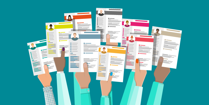
While there are some instances when it might be okay to use a creative resume — say, an infographic or a heavily-designed resume — it’s generally inadvisable. That’s because ATS software will likely have difficulty reading it, which could prevent an otherwise qualified candidate from moving forward in the interview process. It will be confused by aspects such as overly-complicated fonts and JPEGs. Moreover, a human needs to be able to scan your resume quickly, too. Using too many pictures, graphics and fancy fonts may overwhelm them and make it difficult for them to evaluate your qualifications within the short amount of time they’re willing to devote to your resume.
You may still decide to create a less traditional resume, especially if you’re in a creative, artistic profession such as graphic design. In that case, you should still try to keep your margins to between 1/2-1 inch. But think carefully about your design, making sure that every element contributes something to it and that you’re not making it confusing.
Adjusting the margins.
In the vast majority of cases, you’ll be building your resume in Word or Google Docs. You may then save it as a PDF or DOCX. To adjust the margins in Word, navigate to Layout in the top menu bar. Then click Margins, the furthest left option. The document is present to 1″ margins on all sides, and you can choose among four other present options or select Custom Margins to designate different ones.
In Google Docs, go to File and select Page Setup. A window will pop up, and in the right column, you can adjust the margins on all sides. Again, these are preset to 1″ on all sides.
Text alignment.
As with the margins and other aspects of your resume, it may be tempting to get fancy with your text alignment. In a word, don’t. Centering your text or justifying it will make it more difficult to read; you’ll be dealing with uneven spacing and words that may be too far apart or close together when you justify, and centering the text frankly makes it look a little strange and clunky. Instead, left-align your text, as is standard for most documents. On the lefthand side, include information such as job titles, skills and other pertinent information, and on the righthand side, include information such as dates.
Font.
The font you choose needs to be easily ATS-readable, too. That’s why you should stick to straightforward fonts such as:
- Arial
- Calibri
- Gill Sans
- Helvetica
- Times New Roman
- Veranda
There are other options for fonts on your resume, and different recruiters will offer different opinions as to whether you should use a serif versus a sans serif and so on. Generally speaking, just stick to something readable that’s not overly fancy, even if your resume is designed. The size should be readable as well — 10 or 12 pt. Any smaller and the recruiter will have to squint to read it.
When making other font-related choices, such as using italics or bold, just be sure to be consistent. For example, if you italicize one job title, italicize them all. Still, be careful about overdoing it — for the most part, you shouldn’t over-stylize your text or any other aspect of your resume. You’ll want to set your header apart from the rest of the text, of course — for example, you might bold your name or make the font slightly larger — as well as have clear section headings, again in bold or larger text. But for the most part, keep your entire layout clean, simple and as easy as possible to scan and pull out key qualifications. This will make it more likely that ATS software or a recruiter will be able to identify you as a good match for the job at hand — which, of course, is the ultimate purpose of your resume.
Click here for the original article.


